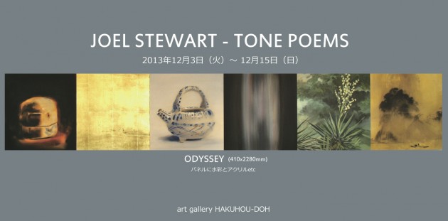
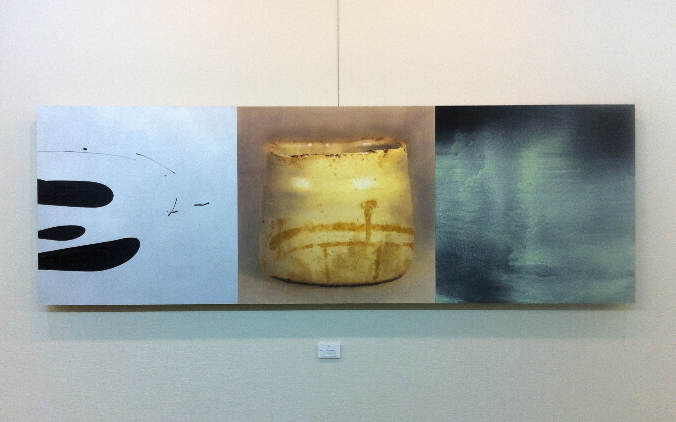
[T]aking photos in Joel Stewart’s painting studio in North Kyoto, I struggle to contain his upcoming exhibition’s signature artwork, Odyssey, within the frame. A horizontal painting comprised of six separate 40-centimeter-square images painted on both paper and canvas, all mounted onto wooden panels and joined together. It is a veritable visual haiku extending more than two meters.
This is a work of art acting in multiple dimensions. The sheer variety of images ranges between the hyper-realistic and the abstract: a gleaming white-and-blue ceramic sake ewer that could almost be plucked from the panel on which it sits; next to it, a quiver of glowing vertical lines reminiscent of Star Trek’s transporter in mid-operation.
If one polarity of Odyssey is degree of realism/abstraction, then another is East/West. An oil painting of a century plant, with its sharp-edged, gray-green leaf-blades, could have emerged from the Realist movement of 19th-century Europe. Its neighbor is a looming ink-brush apparition of a tree-dominated landscape that perhaps has its provenance in an ancient scroll from China or Japan. As a whole, the work invites repeated scanning across its expanse, the eye naturally stopping at points punctuated by subtle distinctions of tone and subject.
Why the disparate, seemingly random combinations of imagery? Stewart credits a handful of prior experiences that led to his current multiple-paneled works, which he calls “Tone Poems.” “I’ve always been fascinated by different kinds of visual languages, or painting styles: anywhere from the old masters to Motherwell’s abstract expressionism, Zen ink painting, modernism, installation art and beyond. I see it all as a vast continuum of creativity to draw from,” he says. “And my development in art over the years also reflects this open-ended interest, starting with watercolor in childhood, then drawing throughout high school, printmaking, theater set design and sculpture in college, and, lately, my work in installation pieces involving mounting my paintings on folding screens. This lifelong theme of mine seems to be about finding ways to bring all of these seemingly disparate elements together.”
In fact, as one glances through a portfolio of photographs of Stewart’s recent folding-screen installation piece (“Crossroads,” an immense work consisting of 60 door-sized paintings of all styles mounted onto several folding screens and arranged into various quasi-sculptural/architectural formations) one can see his current exhibition as a more compact evolution of the idea of playing various styles and mediums off one another, Here, in the current exhibition, the artist has eschewed the folding-screen format for a more minimalist, clean-lined look with his works on paper mounted directly onto specially fitted panels which are then joined together.
As for the unusual juxtapositions – pitting, for example, pure color-field paintings against traditional landscapes and ephemeral flowers – Stewart explains, “Picasso has this quote, something to the effect that ‘I put whatever I like in my paintings and it’s too bad for the subjects themselves: they just have to work it out.’ And while it’s not quite that blithe for me, I can relate to that when making these works. I’m not looking for literal side-by-side meanings, per se (though there are certain connections which exist in many cases), but mainly I am working from the gut level. I put together colors, images and patterns that very simply I have a strong desire to see co-existing side by side.”
Stewart then, it seems, is working with his muses in several different ways, in an attempt to get at some core vibration that encompasses the “parts” but also expands beyond the “things” he paints. The composite image itself telling a kind of abstract story both connected to and beyond the individual parts. “Yes, there is a vibration, a certain wavelength that comes from these pure color panels that differs in timbre from the varied wavelengths coming from the more illustrative work, but to me, they are all coming from the same instrument. Maybe it’s some grand-scale analogue synthesizer or something,” he laughs.
Stewart’s tone poem paintings, then, by extension, can be both a kind of conversation among artistic modes, and also a self-reflective, extended monologue that becomes a coherent artistic statement in its own right. The paintings are – to borrow both another artistic medium and an Eastern expression of it – not so much haiku as renku (collaborative linked verse). The viewer can scan the work for individual meanings as well as the overall tone of the piece at a glance.
When Stewart talks of the various configurations in which his panels can be displayed, we see how much his ideas are still evolving, even ahead of his current show. He enthuses about what it would be like to have all the panels he has so far painted joined in one immense horizontal chain that stretches all the way across the gallery, even around corners. (This reminds me of the horizontal swath of icons that float on the menu screen of a Sony television or gaming machine, with sub-icons ready to access by arrowing up or down on the vertical axis – this is an exhibition that the current “digital native” generation may intuitively appreciate for its sense of possibility.)
Stewart confides that he is working on something else for the exhibition, something that will challenge artistic boundaries even more. It is a reminder that an exhibition is not just an opportunity to display what an artist has done, but an opportunity to propel him or her to further heights of expression. “I want to make work that keeps me intrigued and in a state of wonderment. If it’s too easy for me to figure it out, it won’t sustain my interest for long. I want to be a few steps ahead of myself, actually. That’s where it gets interesting.” .

